22% of the UK population, or 13.9 million people live in poverty in the UK (2016). Poverty rates are higher for lone parent households (46%), disabled households (34), and rates also vary significantly by ethnicity (e.g. the Bangladeshi poverty rate = 50%).
In brief, 22% of the UK population, or 13.9 million people live in poverty in the UK (2016). Poverty rates are higher for lone parent households (46%), disabled households (34), and rates also vary significantly by ethnicity (e.g. the Bangladeshi poverty rate = 50%).
Below is a summary of the latest statistics on the characteristics of those living in poverty in the UK. NB These are the latest stats I could find which have been comprehensively analysed by the Joseph Rowntree Foundation, based on their 2017: Poverty in the UK report.
If you can’t see the above chart online (it’s designed to be downloaded and printed off in A3) the it’s all replicated below!
Basic Poverty in the UK Statistics
A total of 13.9 million people lived in poverty in the UK in 2015-16, or 22% of people live below the poverty line, 30% children, and 18% of pensioners. However, there is significant variation between the proportion of working age adults, pensioners and children living in poverty.
What is Poverty?
Relative poverty: the stats in the JRF report summarised here mainly show ‘relative poverty’: when a family has an income of less than 60% of median income for their family type, after housing costs.
A related measure is persistent poverty which is when a person is currently in poverty and has been in poverty for at least two of the three preceding years.
For more details for different ways of defining and measuring poverty please see this post: What is poverty?
Poverty rates by household type
46% of lone parent households are in poverty, twice as many as all other household types.
Poverty Lines
The ‘poverty line’ varies by household type:
Family type £ per week, equivalised,
2015/16 prices
Couple with no children = £248
Single with no children = £144
Couple with two children* = £401
Single with two children* = £297
*aged 5 to 14
Poverty varies most significantly by disability
In 2016 34% of working-age adults in families with disabled members lived in poverty, compared with 17% of those who did not.
Poverty also varies by ethnicity
Approx. 2016 rates for working age adults Bangladeshi – 50%, Pakistani – 45%, Black British 37%, White – 19%.
Find out more…
There are other variations in poverty highlighted by the JRF report (link above), I’ve just selected the main ‘in focus’ trends as things stand in 2017.
NB on the ‘data lag’ – that’s just one of the problems of Official Statistics more generally – most of the data above has been analysed from various different types of government stats, which are already a year out of data before the ONS publishes them, then you have wait further for the JRF summary. If you want the 2018 stats, you’ll just have to wait til 2019!
If you like this sort of thing, then you might also like my previous post on ‘Poverty Trends’ in the UK, which looks at how poverty rates changed between 1996 and 2016.
How do we explain the long term decline in UK Poverty rate, and its more recent increase?
The UK has seen significant falls in poverty over the last 20 years, HOWEVER, this progress is now at risk of reversing as poverty rates have been increasing in recent years. This blog posts summarizes the 20 year trend in UK Poverty according to the Joseph Rowntree Foundation’s 2017 Poverty Report. Specifically it looks at:
The overall 20 year trend in UK poverty
poverty among pensioners and children
Three drivers of the reduction in poverty rates
Three threats to the continued reduction in poverty rates
NB I’m using the same information from the report, but I’ve changed the order in which it’s reported and summarized it down further. Personally I think my version is much more immediately accessible to your ‘non-expert’: IMO the ‘JRF have a tendency to ‘over-report’ reams of nuanced data, and the overall picture just gets lost. The detail’s important if you’re a policy wonk, but probably going to get lost on the average, interested member of the general public.
Before reading this post you might like to check out my ‘what is poverty?‘ post which covers the basic definition of some of the terms used below.
The overall 20 year trend in UK poverty….the fall and rise of UK poverty rates
20 years ago, in 1996, nearly a quarter (24%) of the UK’s population lived in poverty. By 2004, this had fallen to one in five (20%) of the population. However, by 2016, the proportion had risen slightly to 22%.
*Relative poverty is when a family has an income of less than 60% of median income for their family type, after housing costs.
Children and pensioners living in poverty
As the chart above clearly shows, the biggest success stories in the long term reduction in poverty over the last 20 years are the numbers of pensioners who have been taken out of poverty and (to a lesser extent) the number of children.. As the chart above shows:
In 1995, 28% of pensioners lived in poverty, falling to 13% in 2012, but rising to 16% by 2016.
In 1995, a third of children lived in poverty, falling to 27% in 2012, but rising to 30% in 2016
However, during that time the proportion of working age couples without children in poverty actually grew slightly, from 16% to 18%.
Factors correlated with falling poverty rates
The report notes three main factors which are mainly responsible for this long term overall decline in poverty:
Rising employment, linked with higher wages due to the minimum wage, and better education.
Increased support through benefits, especially the increase in the state pension age, but also out of work benefits for working age people with children
Housing benefit and increased home ownership containing the impact of rising rents.
Factors explaining the long term decrease of UK Poverty in more depth
It seems that the main drivers behind the long-term decrease in poverty in the UK are the ‘positive’ economic factors such as improvements in the employment rate, pay and conditions, rather than increases to benefits.
Below I select what appear to be the five most import factors from the report which explain the long term decrease in poverty.
The increase in the state pension
The most significant reduction in poverty has been achieved with pensioners, and according to the JRF report, the main reason for this was a one off increase in the state pension at the beginning of the century:
NB – there is a lot of variation in pensioner income, which I may explore in a future post…
The employment rate has increase from around 71% in 1996 to around 75% in 2016…
NB – while you are statistically more likely to be in poverty if you’re not in-work, being employed it itself is not sufficient to avoid being in poverty. Both the introduction of the minimum wage, and changes to in work benefits for lone parents have been essential to making sure that a higher proportion of people in employment are also not officially in poverty. While work today is more likely to lift you out of poverty than in 1996, it remains the case that a large percentage of those in poverty are in-work (typically in part-time jobs).
Earnings are up for people with all levels of qualifications…
Obviously higher earnings are more likely to lift people out of poverty, HOWEVER, at the bottom end of the income earning scale, and especially for those with children and in part-time jobs, the increasing cost of living, especially rent (but also childcare and even food and utilities) has negated much of the above increase in wages, hence why government support in the form of child tax credits and housing benefit remains important.
The number of people with degrees has nearly trebled in this period: from around 12% of the UK population to over 30%
Those with degrees earn approximately twice the amount of those with no qualifications, so it would seem that New Labour’s focus on ‘education, education, education‘, and their push to get more people into higher education has had a positive impact in poverty reduction. However, with the introduction of tuition fees and with increasing competition for highly skilled jobs coming from abroad, it’s not clear that this trend (of more and more people getting degrees) is set to continue.
The introduction of the national minimum wage has resulted in a 46% relative pay increase for the poorest 10%, compared to a 40% median national increase
Both the introduction of the minimum wage and its subsequent increases seem to have been one of the most important factors in tackling in-work poverty. However, even with the minimum wage, a possible future barrier to further poverty reduction lies in the growth of precarious jobs leading to ‘underemployment’ – where people get too few hours to earn a decent living. For more on this, see my summary of the RSA’s report on ‘Future Work in the UK‘.
The increase in out of work benefits for people with children
Basically, there has a been a very slight long-term increase in out of work benefits for people with children, who are now slightly better off than 20 years ago, while poor people without children have seen no change, or are slightly worse off.
I guess this leads to an overall reduction in the poverty rate simply because there are more people per family household rather than just couple or single person household.
You can see from the above chart, that lone parents claiming JSA and child benefits were briefly lifted to 60% of median income (just on the poverty line) – sufficient to take them out of poverty, however, you can also see that benefits are again being cut back, so we can probably expect poverty rates to increase again in the future!
And one factor which doesn’t seem to explain the overall reduction in poverty… changes to in-work benefits…
With the exception of single parents who are better off over a twenty year period, every other household type seems to be worse off! Thus I can’t see how this variable would explain the long term decrease in UK poverty.
Potential barriers to further reductions in poverty
All three of the main drivers of poverty reduction mentioned above are now under question:
The continued rise in employment is no longer reducing poverty.
State support for low-income families is falling in real terms, and negates the gains made by increasing employment and wages.
Rising rents, less help for low-income renters and falling home ownership leave more people struggling to meet the cost of housing.
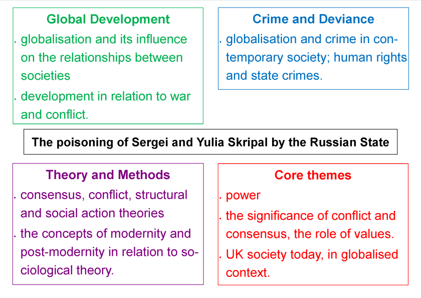
The recent ‘russian spy poisoning’ is relevant to many areas of the A-level sociology specification, such as state-crime, globalisation and even consensus and conflict theory.
The recent poisoning of Sergei and Yulia Skripal, allegedly by the Russian State, is relevant to many areas of the A-level sociology specification.
Details of the poisoning
On 4th March 2018 Sergei Skripal, 66, and his daughter Yulia, 33 were poisoned by a nerve agent called Novichok. The pair were found collapsed on a bench in Salisbury in the late afternoon, following what seems to have been a pretty ordinary ‘afternoon of leisure’ involving a trip to a pub and lunch in Zizzi’s. Four weeks later, they remain in a critical condition.
Sergie and Yulia Skripal
Much of the news has focused on just how deadly the nerve agent ‘Novichok’ is – basically a tiny, practically invisible amount was sufficient to render two people seriously ill, and even the police officer who first attended Sergei and Yulia Skripal was taken seriously ill just from secondary contact with what must have been trace elements of the nerve agent.
Pretty much everywhere the pair had visited that afternoon was shut down, and any vehicles that they had been in contact with were quarantined while they were cleared of any trace of the nerve agent and total of 250 counter-terrorism officers are at work investigating the case.
Theresa May has accused the Russian State as being complicit in this attempted murder, which seems plausible as Colonel Sergie Skripal is a retired Russian military intelligence officer who was convicted of passing the identities of Russian intelligence agents working undercover in Europe to the UK’s Secret Intelligence Service, MI6. He was jailed for 13 years by Russia in 2006. In July 2010, he was one of four prisoners released by Moscow in exchange for 10 Russian spies arrested by the FBI. He was later flown to the UK. It seems that the poisoning is the Russian State passing its ‘final sentence’ on this poor guy.
HOWEVER, Russia strongly denies these allegations, so this might just be a hypothetical state-crime!
The international reaction to the poisoning has also been dramatic: to date 26 countries have expelled Russian diplomats, and Russia, which of course denies any involvement in the poisoning, has done the same as a counter-response.
Links to the A-level sociology specification
Probably the most obvious link to the A-level sociology specification is that this is a primary example of a state crime – it seems extremely likely that the poisoning was carried out by an agent of the Russian state – The UK condemned Russia at the United Nations Human Rights Council as being in breach of international law and the UK’s national sovereignty.
Thirdly, you could use this as an example of how ‘consensus’ and ‘conflict’ exist side by side. he existence of global values allows various nations to show ‘solidarity’ against Russia and express ‘value consensus’ but it also reminds us that there are conflicting interests in the world.
Fourthly, media coverage aside, it’s hardly a post-modern event is it! Having said that, we don’t know for certain who did the poisoning, so all of this could be a good example of ‘hypperreality’.
There’s lots of other links you could make across various modules – for example, the way the media has dealt with the event (it’s very news worthy!) and the ‘panic’ surrounding it, it fits with our ‘risk conscious society’ very nicely!
According to the latest police recorded crime figures there has been a significant increase in crime in the last year:
Gun crime has increased by 27%
Knife crime has increased by 26%
Robberies have increased by 25%
Stalking and Harassment have increased by 36%
At first site, what’s interesting about these figures is that they not only demonstrate a radical increase, but this abruptly reverses the recent trend in declining violent crime:
However, these figures may not actually give us a reliable picture of the actual change in violent crime because of ONE simple fact: police forces in England and Wales are facing significant budget cuts, and so there may have been a more concerted effort on the part of the police to detect and record crimes over the last year – if crime can be shown to be going up, then this can be used as evidence to not cut police funding.
Then there’s the possibility that the public may be reporting more crimes – the ability to report online, for example, makes it easier to do so, and where harassment crimes are concerned, this may be due to a wave of recent campaigns such as the Everyday Sexism blog, to raise awareness of the fact that such behaviour is not acceptable.
British Crime Survey, based on accounts by victims, shows that crime is still going down, and this is generally regarded as a much more valid way of measuring the extent of crime in England and Wales than police recorded crime, as the BCS removes the subjectivity-bias of the police in investigating and recording crimes:
In this Channel 5 series, one family in the ‘wealthiest 10%’ of Britain swap lives for a week with a family in the ‘poorest 10% of Britain’. As I see it this programme performs an ‘ideological control function’ – spreading the myth of meritocracy.
They two families swap houses, budgets and leisure-timetables for a week – in episode two for example, the poor family, living on the rich family’s typical weekly disposable income, have to live off about £3000 per week, while the rich family, have to live off just under £200 per week, and in this episode, both families seem to be genuinely hard working and just, well, nice.
The ‘Poor House’
The meat of the programme consists of watching the families hanging out in their respective houses, doing whatever activities the other family would normally do, and meeting their respective friends/ work colleagues, including some running reflections on how ‘nice’ it is to be rich, and what a ‘struggle’ it is to be poor.
The ‘rich house’
Here’s how the programme performs the function of ideological control – basically it spreads the ‘myth of meritocracy‘.
It misrepresents what the top 10% look like – the narration keeps talking about how the rich family is in the top 10%, they are, but their weekly disposable income of over £3K, and the fact that they own 12 restaurants and employ 60 odd people, puts them easily in the top 1%. This fact alone really annoys me – it is the extreme minority that lives like this. I worked this out using the IFS’ income calculator)
The family in the top 1% are further unrepresentative in that the father genuinely worked his way up after failing school, cleaning toilets and then getting into restauranteering. This is most definitely NOT how the majority get into the top 1%, especially since social mobility has been declining in recent years.
The working class father keeps saying ‘I want my children to see this and want this’ – he seems to take the experience of his week in the rich mans world as evidence that anyone can make it if you try hard enough – in fact there is LESS CHANCE TODAY HIS KIDS than he would have had to climb the career ladder.
Maybe the same point as above – the working class guy has 4 kids – I wonder what the actual chances of all four kids from one working class family independently becoming millionaires actually are? It’s probably lottery odds.
The ‘luck’ word is mentioned once, apparently it’s all about hard work. NO – this view is just plain wrong, Malcome Gladwell convinced me of this in his book ‘Outliers’
Personally I think this series (if it carries on this vein) is lazy and appalling television – it wouldn’t take much to add in some depth analysis, have some commentary or stats overlying how likely it is for someone to go from working class to millionnaire, for example.
The Poor Family – now none the wiser as to how they’ve been shafted by 30 years of neoliberalism
There’s also absolutely no mention of the sheer injustice of the fact that both sets of parents are doing similar amounts of ‘work’ but the rewards are so incredibly different, and no mention of how good it is that we’ve got social housing so at least the poor family have a decent house.
The rich family – nice enough, but so few these days climb the class ladder.
In short, my intense dislike of this show stems from the misleading portrayal of the richest 1% as representing the richest 10% and from its total lack of analysis of the actual chances of social mobility occurring.
NB – It was also quite dull viewing. If you think it sounds a little like Wife Swap, it’s much less entertaining as it’s the whole family doing the swapping, so there’s much less conflict.
The issue of why there are inequalities by ethnicity in the UK is a topic which runs all the way through the A level sociology syllabus. This post simply presents some sources which provide information on the extent of inequality in life chances by ethnicity in contemporary Britain.
As it stands, in 2017 it seems that:
ethnic minorities are less likely to be offered places at Britain’s top universities
ethnic minorities have higher rates of unemployment
ethnic minorities are more likely to be arrested, charged, prosecuted and imprisoned.
Ethnic minorities are less likely to be offered places at Britain’s top universities
Russel Group universities are less likely to provide ethnic minorities with offers of a place, even when grades and ‘facilitating subjects’ have been controlled for.
White British students have the highest chance of being offered a place, with 52% of candidates receiving offers, while Black African students have the lowest chance, with only 35% of candidates receiving offers of places. (source: Manchester University Policy Blog, 2015) also see: (source: UCU research paper).
Oxford University has also been accused of being biased against Ethnic Minorities: according to Full Fact – in 2013 the Guardian revealed that only 17.2 percent of ethnic minority applicants were admitted to Oxford University, compared to 25.7 per cent of white applicants, and earlier this year (2017) MP David Lammy argued that this issue has not yet been addressed.
NB – It’s worth mentioning that the Russel Group universities, and Oxford University explain this away by saying that ethnic minority students are more likely to apply for more demanding courses for which they don’t necessarily have the grades, hence their higher rejection rate.
Ethnic minorities have higher unemployment rates
Ethnic Minorities are almost twice as likely to be unemployed compared to white people (source: ONS employment data)
In January – March 2017 the unemployment rate was 4.1% for white people compared to 7.9% for people from a BAME (Black, Asian, and Minority Ethnic) background.
There are significant variations by both specific ethnic and group and age: for example, Bangladeshi and Pakistani Britons have the highest unemployment rates relative to other ethnicity in all ages.
This difference is at least partially explained by the relatively high levels of unemployment among Pakistani and Bangladeshi females, which is significantly higher than male unemployment, a trend on found in these two ethnic groups.
Ethnic minorities are more likely to be charged for comparable offences
According to a recent study headed by David Lammy MP, ethnic minorities are more likely than white people to be arrested by the police, to be prosecuted by the CPS, and to be sentenced and jailed by judges and juries.
A Guardian article outlining the findings of the report (link above) notes that
‘Disproportional outcomes were particularly noticeable in certain categories of offences. For every 100 white women handed custodial sentences at crown courts for drug offences, the report found, 227 black women were sentenced to custody. For black men, the figure is 141 for every 100 white men.’
NB – It’s particularly interesting to note the disparities in sentencing for black women, suggesting a truly massive ‘intersectionality effect’
Comments/ Questions
This is just a brief ‘update post’ providing links to some recent statistical evidence on ethnic inequalities across a range of topics in A-level sociology.
You should always question the VALIDITY of these statistics – the drug offences stats, for example, do not tell us the severity of offence. It may just be that all of those black women were caught smuggling drugs whereas white women are more likely to be caught ‘merely’ dealing them… not inconceivable!
Also, even if you accept that the stats have at least some validity, you’ll need to dig even deeper to deeper to find out why these inequalities in life chances by ethnicity still exist!
Official Statistics on schools, teachers and educational achievement provided by the United Kingdom government provide an overview of the education system. They are useful for providing an ‘introduction to the state of education in the U.K’, before embarking on the core content of any sociology of education course and providing a basis for comparing the U.K. education system to the education systems of other countries, which would be relevant to the module on global development.
I will also provide a brief discussion of the validity and representativeness of the official statistics below, tying this into research methods.
I only deal with state-schools in this post, I’ll do a separate post in future on private, or independent schools in comparison to state schools.
Also, the post below deals primarily with England and Wales, I will add in details for Wales and Scotland when I can.
For 2020-21 expenditure per education sector broke down as follows:
Primary education expenditure – £27.3 billion
Secondary education expenditure – £40.0 billion
Tertiary education expenditure – £4.9 billion
Spending Per Pupil was £6500 in 2019-2020
The above chart, from the Institute for Fiscal Studies shows us education spending in real terms at 2019-2020 places. We can see that in real terms expenditure per pupil has decreased slightly since 2010, when New Labour left office and the Tories came to power.
This means primary schools are lot smaller in scale in that each of them has, on average, fewer pupils in them, and should be more ‘locally based’ for most parents.
Secondary schools are a lot larger, will have many more pupils in them, have more of an ‘education factory’ feel to them and be more widely dispersed, meaning children will have to travel further to them.
This is despite the fact that there are more secondary school aged pupils compared to primary school aged pupils.
There were 10.5 million school pupils in England and Wales in 2020-2021
This reflects recent demographic trends in the United Kingdom – a baby boom which started in the mid 2000s has seen an increase of 400 000 pupils in the school system as a whole (primary and secondary).
There were 11 600 pupils in Pupil Referral Units in 2021
The number of pupils in PRUs fell from over 15000 in 2015/16 to just just 11 000 by 2020/21
A total of 12.6% of pupils have Special Education Needs in 2021-2022
And four percent of these have a formal statement.
There has been a slight increase in the number of Special Education Needs pupils since 2015/ 16 – a 1% increase in all SEN pupils and a 1.2% increase in SEN pupils with statements.
I’ve left the following historical data in place following a recent update of this post (updated October 2022) as I think it demonstrates how such statistics in particular are socially constructed…
Between 2010 to 2015 the number of pupils with special educational needs fell from 21% to 15%
NB – if you read this in conjunction with the ‘types of school chart’ above, then it suggests that special educational needs (SEN) students are becoming increasingly segregated into special schools and/ or pupil referral units, rather than being dealt with in mainstream secondary schools.
You might also want to think about the extent to which ‘Special Educational Needs’ and ‘Special Educational Needs with statements’ are socially constructed.
Looking back at 2007, 20% of pupils were officially characterised as SEN, but by 2021 this had fallen to 12.6%.
According to labelling theory this is more likely to be because the formal criteria and processes according to which pupils are given the SEN label have changed over the past 15 years, rather than any underlying changes in the actual number of pupils with Special Educational needs.
At the end of 2020 the proportion of 16-18 year olds in education and work-based learning was 81.2%
NEET stands for ‘Not in Education, Employment or Training’ and the government keeps records of the proportion of 16-14 year olds which fit into this category.
The medium term trend in NEETs is that the proportion has fallen from 16% of 16-24 year olds in 2013 down to 11% in 2017.
The NEET figure has been relatively stable for the last five years, holding at around 11% up until today in 2022.
There were 2.4 million students in UK Higher Education Institutions in 2019-2020
The number of full time equivalent students studying their first degrees or post graduate degrees has been increasing steadily over the past few years.
Around 1.9 million students are studying undergraduate degrees or equivalent while 0.5 million are studying towards a Postgraduate degree.
The vast majority of students studying towards their first degree are British, almost 80% in fact, but around 40% of students studying PostGraduate degrees in UK institutions are from abroad, and most of those from outside the UK!
There were 465000 Teachers (FTE) in the UK in 2021/22
There were 465 000 Full Time Equivalent (FTE) teachers employed in England and Wales in 2021/22.
There were 503 000 Full Time Equivalent support staff
The total FTE number of staff employed in schools in 2021/22 was 968 000.
30% of teachers drop out after 5 years of qualifying
12.5% of teachers drop out after just one year of qualifying
Just over 30% drop out within five years.
How useful are these education statistics?
Such statistics are a useful starting point if we wish to make cross-national comparisons between the U.K. education system and the rest of the world, which would be useful for students of global development, given that education plays a key role in development. Indeed if we wish to compare the relationship between education and development in several countries, statistical rather than qualitative comparisons may be the only way of doing so.
From an arrogant, modernisation theory perspective, these statistics provide an indication of the level of investment required in terms of expenditure and teachers, and the types of outcome that less developed countries should be aiming for.
Most of the education statistics above count as ‘hard statistics’, i.e. there’s little room for disagreement over the ‘social facts’ which they show – for example, it’s hard to argue with the stats on ‘number of schools’ and ‘number of qualified teachers’.
However, others are much softer, and have more validity problems, and can be criticised for being social constructions rather than reflecting underlying reality: the statistics on special educational needs clearly come under this category – there is simply no way the underlying numbers of students with ‘SEN’ have decline from 21 to 15% in 5 years while the number of certificated SEN kids have increased – what’s really happened is that the number of kids which schools categorise as having Special Education Needs has decreased in the last 5 years, probably because the Tory’s cut previously existing funding for this category of student in 2010 (ish).
Signposting and Related Posts
As mentioned above this is introductory material for the education topic. For more posts covering theories of education, education policies and educational inequalities by class, gender and ethnicity, please see my sociology of education page.
Links to statistics on education in the United Kingdom:
Most of the statistical sets below are updated yearly, or more frequently.
Education and Training Statistics for the U.K. – published by the department for education. In this source you’ll find data on the number of schools, teachers, and teacher-pupil ratios as well as basic educational achievement data by Free School Meals, gender and ethnicity. Published annually in November.
School Workforce in England – covers teacher numbers and pupil-teacher ratios in primary and secondary schools in England and Wales. The latest figures from November 2021.
Special Education Needs in England – details of children with special education needs, by type of need, and broken down by school type and gender (statistics derived from the ‘schools census’).
Evidence from Kat Banyard (2010) The equality illusion– the truth about women and men today, Faber and Faber.
Today it is normal for women to worry about their looks. Girls have starkly different relationships to their bodies than boys – they put greater emphasis on how attractive their bodies are to others – for boys physical prowess – what he can actually achieve is more important than looks. Banyard cites the following evidence to support her view that women are more concerned about their looks than men –
1. 1.5 million people in the UK have an eating disorder – 90% of them women and girls
2. A survey conducted by Dove of 3000 women found that 90% of them wanted to change some aspect of their body with body weight and shape being the main concern.
3. One in four women has considered plastic surgery.
4. An analysis of animated cartoons shows that female characters are far more likely to be portrayed as physically attractive than male characters and those who are attractive are far more likely to be portrayed as intelligent, employed, happy, loving and involved in kissing and hugging.
5. In 2007 a survey of Brownies aged 7-10 were asked to describe ‘planet sad’ they spoke of it being inhabited by girls who were fat and bullied about their appearance.
6. A survey conducted in 2009 found that a quarter of girls thought it was more important to be beautiful than clever. – Youngpoll.com
7. The more mainstream media high school students watch, the more they believe beauty is important according to the American Psychological Association.
8. The media furore over Susan Boyle was mainly because she didn’t conform to the female stereotype of beauty.
9. In 2009 the Bank of England held a seminar for its female employees called ‘dress for success’ – where they were informed, amongst other things, to ‘always wear make up’, there was no such equivalent for men
10. Some studies have shown that the more a girl monitors her appearance, the less satisfied she will be with her appearance.
11. Two thirds of women report having avoided activities such as going swimming or going to a party because they feel bad about their appearance while 16% of 15 -17 year olds have avoided going to school for the same reason.
12. One experiment found that female students performed worse in maths tests when wearing a swim suit compared to regular clothes while boy’s performance doesn’t decrease under the same conditions
Analysis – what Banyard actually thinks is wrong/ harmful about this situation…
‘The existence of a suffocating ideal of beauty has persisted and it has remained a gendered phenomenon. Women are judged on their ability to conform to a beauty ideal – there is a cultural pressure to manipulate their bodies to fit into a pre-existing ideal – to treat your body as an object that will be consumed by an observing public (This is known as objectification)
While some Feminists argue that the Feminine pursuit of beauty is simply a matter of choice – women freely choose to do it (Baumgardner) others (Jefferys) argue that the practise of beautification reflect and perpetuate gender inequalities – women put effort into displaying their femininity/ sexuality because they are relatively powerless – and those women that do engage in the practise of beautification perpetuate the idea that a woman’s value is in her beauty.
Millions of girls and women begin their days with beautification rituals because their sense of self hinges on the gaze of others. If your sense of self esteem depends on what you think others think of your appearance, can you really be said to have freedom of choice? Also, can you really say women are equal to men in this respect?
One of the reasons for the persistent problems of body image faced by females is that girls are taught from a very young age that their physical appearance is a reflection of their worth and value, and treated accordingly.
Stratification is one of the core themes within A level Sociology and Sociology more generally. One of the major sources of stratification is found in differences between wealth and income within the UK. According to various sources of statistics (of course you should always question where these come from!) the UK is one of the most unequal countries in the developed world, and this is something I like to bang on about a lot. Below are a few handy infographics which illustrate the extent of wealth and income inequality in the UK.
This first infographic from the excellent Equality Trust (authors of The Spirit Level) provides a nice general overview. The headline figure is quite easy to remember – the top o.1% earn about 100 times more than the bottom 90%, and the ratio is roughly the same for the earnings of a CEO of a FTSE 100 company compared to the average UK income.
2. This infographic from Income Inequality Briefing reminds us that the wages of the richest have increased, while the relative wages of the poorest have decreased in real terms.
3. This third infographic, again from the Inequality Briefing, looks at things regionally – Basically I think it tells us that the wealthiest region (London) is twice as wealthy in terms of wages as the poorest (up north somewhere or Welsh valleys). It also reminds us that the UK is one of the most unequal countries in Europe. Basically the average income in London is double the average income in the West Midlands.
4. This final infographic from the Office for National Statistics at least reminds us that taxation and benefits do help to reduce income inequality to an extent. Before tax and benefits the richest 20% of households are 14 times richer than the poorest, but after tax and benefits, the ratio reduces 4. NB1 – If you were comparing the richest 10% with the poorest 10% the difference would be larger. NB2 remember that most people who receive benefit are actually in work, and benefits (e.g. housing benefit) tops up their low wages.
healthy life expectancy isn’t keeping pace, and the sheer cost of looking after the elderly in the context of family-individualism make the ageing population a problem!
Populations across Europe are getting older which can create social problems related to higher levels of poor health among older people and a greater financial and caring ‘burden’ on younger generations.
But careful social planning can help to overcome these challenges.
What are the consequences of an ageing population?
In 1850,half the population in England were dead before they reached 46. Now half the population in England are alive at 85; and 8 million people currently alive in the UK will make it to 100 years or more. And if we extrapolate that to Europe, we can say 127 million Europeans are going to live to 100.
Hans Rosling points out that: We reached the turning point five years ago when the number of children stopped growing in the world. We have 2 billion children. They will not increase. The increase of the world population from now on will be a fill up of adults.
Health Secretary Jeremy Hunt: The two biggest issues that we face as an ageing society are the sustainability of the NHS and the sustainability of the pension system; and within the NHS, I include the social care system as part of that.
The basic problem we have in Northern European countries is the generational tension between individualism and communal responsibility – Across the generations within a typical family we have become more individualistic and less collective/ communal:
People in their 80s (who grew up in the 1960s) are generally very individualistic – they have retired into property wealth and are unwilling to relinquish the independence this gives them. They have also socialised their children into being more independent: most people today in their 50s (the children of those who are in their 80s) have bought into this – The family norm is one of the typical 50 year old living an independent life with family, miles away from their own parents.
Grandparents today of course help out with childcare occasionally and pay regular visits, but they are generally not taking a day to day role in childcare, and finances are kept separate. This arrangement is mutual – People in their 80s don’t want to be burdens on their children, they want them to have the freedom to live their own lives – to be able to work and raise their children without having to care for them in their old age. (So I suppose you might call the 2000s the era of the individualised family).
(This is very different to what it used to be like in the UK, and what it is still like in many other parts of the world where grandparents live close by and are an integral part of family life, taking an active role in raising their grandchildren on a day to day basis. Various interviewees from less developed countries testify to this, and to the advantages of it.)
Within this context of increasing ‘familial-individualism‘ a number of problems of the ageing population are discussed:
Increased family individualism
One of the main problems which this increasing ‘familial-individualism’ creates for people in their 80s is one of increasing isolation and loneliness as their friends and neighbours move away or die.
One proposed solution is for older people to be prepared to move into communal supported housing where there are shared leisure facilities, like many people do in Florida. However, people are quite set in their ways in the UK and so this is unlikely. A second solution, which some immigrants are choosing is to return to thier country of origin where there are more collectivist values, trading in a relatively wealthy life in the UK for less money and more community abroad.
Healthy Life Expectancy
A second problem is that healthy life expectancy is not keeping pace with life-expectancy, and there are increasing numbers of people in their 80s who spend several years with chronic physical conditions such as arthritis, and also dementia – which require intensive social care.
Low ‘healthy life expectancy’ is more of a problem for the most deprived
As with the first point above, this is more of a social problem when children do not see it as their duty to care for their elderly parents – It is extremely expensive to provide round the clock care for chronic conditions for several years, and this puts a strain on the NHS. Basically, the welfare state cannot cope with both pensions and chronic care.
One potential solution to the above is mentioned by Sally Greengross: the Germans in some cases now export older people to Eastern European countries because they can’t afford – or they say they can’t – to provide all the services they need in Germany itself. Could this be the future of chronic elderly care in the UK – Exporting dementia patients to poorer countries?
However, the idea of care-homes themselves are not dismissed when it comes to end of life care – the consensus seems to be that the quality of care in UK elderly care homes is generally very good, and better than your typically family could provide (despite all the not so useful scare programmes in the media).
No money left for the young
A third problem is for those in their 50s – with their parents still alive and ‘sucking money out of the welfare state’ there is less left for everything else – and this has been passed down to the youngest generation.
As a result people in their 50s now face the prospect of their own children living at home for much longer and having to help them with tuition fees and mortgage financing, meaning that their own plans for retirement in their late-50s/ early 60s are looking less likely – In other words, the next two generations are bearing a disproportionate cost of the current ageing population.
Worryingly, there is relatively little being done about this in government circles – Yes, the state pension age has been raised, and measures have been taken to get people to bolster their own private pensions, but this might be too little to late, and it looks like little else is likely to be done – The issue of the ageing population and the cost of welfare for the elderly is not a vote-winner after all.
The programme concludes by pointing out that pensions and care homes are only part of the debate. What will also be needed to tackle the problems of the ageing population is a more age-integrated society, a possible renegotiation at the level of the family so that grandparents are more integrated on a day to day basis in family life (trading of child care for a level of elderly care) and also social level changes – to make work places and public places more accessible for the elderly who might be less physically able than those younger than them.
A related topic in the Global Development module is the question of whether ‘overpopulation’ is a problem – an informed view on this topic is that of Hans Rosling’s who argues that ‘overpopulation’ isn’t really a problem at all because of the rapid global decline in birth rates.