Gillian Keegan, the Education Secretary, claimed that school funding was at a record high, but an IFS report contradicts this. The government manipulates statistics by focusing on specific age ranges to present a positive image. Cuts have been made in sixth form, Local Education Authorities, and capital spending, highlighting government bias in statistics. This emphasizes the importance of critical analysis in government data.
The Education Secretary, Gillian Keegan recently claimed that school funding was at a record high. She claimed that schools were being funded at the level of £60 billion a year, the highest per-pupil figure in history.
However this is not accurate, according to a recent episode of More or Less on Radio 4.
According to Luke Sibieta, research fellow at the Institute for Fiscal Studies (IFS):
Between 2010 and 2019 spending per pupil fell by about 9% in real terms. Since 2019, the government has increased school funding. Spending per pupil should be back to about where it was in 2010 by 2025, but only just.
Prior to 2010 (when the Tories came to power) real-terms spending on education per pupil increased year on year. It was true to say that school spending was at ‘record levels’ nearly every year all the way back to 1945.
The fact that this is now worth mentioning highlights the historically unusual cuts to school funding under Tory government for the last decade.
The above figures from the IFS refer to spending on all pupils from the age of 3 all the way up to age 19.
How the government manipulated the official statistics
The government uses spending on pupils aged only 5-16. By selecting these figures the government is able to paint a more positive picture of school funding over the years. Spending on 5-16 year olds shows flat spending during 2010-2015, then a cut to 2019. Then after this an increase.
The government figures disguise the severe 25% cuts they have made to sixth forms over the last decade.
The government figures also disguise cuts to Local Education Authorities which used to fund many important services to schools. Such services included SEN spending and running administrative services such as pay-rolls for example. Local Authority education funding for these services have been cut by 50% between 2010 and 2019. Schools now have to pay for these things themselves out of smaller budgets.
The government figures also disguise severe cuts to capital spending. Spending on school buildings and repairs was 20% lower in the last three years than it was in the late 200os.
This brief update is a good example of government bias in the use of statistics. The government deliberately selects a narrow age-range to get a positive spin or bias on the education spending figures.
However their claims are kept in check by the more objective IFS. Their more complete data with a broader age range (3-19) shows us that spending hasn’t been as much as the Tory’s claim.
I caught an episode of Woman’s Hour last week in which the presenter kept mentioning that according to a recent survey 62% of people in the UK had volunteered in the last week, and inviting people to discuss their experiences of voluntary work.
The show was then peppered with references to people’s volunteering efforts, such as working with the homeless at Christmas, staffing food banks, helping out with the Covid-vaccination efforts and so on.
And such examples fit very well with my own imagination of what ‘voluntary work’ involves – to my my mind a volunteer is someone who commits an hour or maybe more a week (I have a low bar in terms of time!) to do something such as the above, probably in conjunction with a formal charity or at least other people as part of a team.
But I just couldn’t believe that 62% of people did that kind of voluntary work last year.
And it turns out that they don’t
The government survey (a form of official statistics) that yielded these results distinguishes between formal and informal volunteering.
The former type: formal volunteering is what I (and probably most people) think of as ‘real volunteering’ – it was these kind of things the Woman’s Hour presenter was interested in hearing about and publicising.
However, only 17% of people did formal volunteering last year…..
Just over 50% of people did ‘informal volunteering’ but this has a VERY LOW BAR for inclusion. Basically, if you babysat your friend’s kids for one day at some point last year, you get to tick the box saying that you did ‘informal volunteering’.
This basically means that ANYONE with a young family has done what this society defines as ‘informal volunteering’ – I mean surely EVERY FAMILY babysits once in a while for their friends – this is just normal parenting – children have friends, parents want a day to themselves every now and then so you ‘babysit swap’ – or sleepovers, technically you could count having your friends’ children over for a sleepover with your own kids as ‘having done voluntary work’ in the last year’.
Add formal and informal volunteering (/ mutal parental favours) together and you get that 62% figure that the Woman’s Hour presenter was talking about.
However to my mind 62% is a completely misleading figure – 17% is how many people ACTUALLY volunteer every year!
It’s a bit annoying TBH – as also in the ‘informal volunteerin’ category are things such as buying shopping for someone who can’t get out of the house and that’s LEGIT, or valid volunteering in my mind, but the category is too inclusive to give us any useful data on this.
Relevance to A-Level Sociology
This is a wonderful example of how a definition which is too broad, in this case what counts as ‘volunteering’ can give a misleading, or invalid impressing of how much actual voluntary work really goes on in the UK.
This survey is a form of official statistics, so you can use this example to be critical of them.
it is possible that the government officials deliberately made the definition so broad so as to give the impression that there is more community spirit, or more of a ‘big society’ around than there actually is – because if there’s lots of community work and voluntary work going on, it’s easier for the government to justify doing less.
However, even with these very broad definitions, the trend in volunteering has still been going down in recent years!
The figures show that women commit less crime than men, and less serious crimes than men.
This is an important update for the gender and crime topic which makes up part of the A-level sociology crime and deviance module.
There are approximately equal numbers of men and women in the population as a whole, but 85% of people arrested are male, around 75% of those prosecuted are male and 95% of people who go to prison are male, meaning women only make up 5% of the total prison population.
Both the male and female crime rates seem to have been declining over the last five years of statistics, with fewer men and women being dealt with by the criminal justice system.
The male crime rate does seem to be declining faster than the female crime rate, with the female crime rate seeming to level off somewhat more recently.
Men Commit more serious crimes than women (I)
‘Indictable offenses’ in the darkest blue below are those more serious offences dealt with by the crown court. Men are twice as likely to be on trial for an indictable offence compared to women.
78% of males are in court for summary (less serious offences) compared to 90% of women, and men are more likely to on trial for motoring offences!
Men commit more serious crimes than women (II)
The chart below shows you that for the more serious, indictable offences such as violence and robbery, men commit around 85-90% of these, but for sexual offenses 98% of offenders are men, only 2% are women.
The most equal in terms of gender are fraud offences and summary non-motoring offences….
Women only make up 5% of the prison population
This is related to their committing less crime and less serious crime than men, although some sociologists (read on!) have argued this is because the courts are more lenient towards women (others argue it’s the opposite, saying the course are harsher towards women.
One of the supposed advantages of official statistics is that they are quick and easy to use to find out basic information.
To test this out, I use the following as a starter for my ‘official statistics’ lesson with my A-level sociology students:
I print the above off as a one paged hand-out and give students 10 minutes to find out the approximate answers to each of the questions.
If some students manage to find all of them in less than 10 minutes, they can reflect on the final question about validity. I wouldn’t expect all students to get to this, but all of them can benefit from it during class discussion after the task.
Official statistics stater: answers
Below are the answers to the questions (put here because of the need to keep updating them!)
How many cases of Domestic Violence were there in England and Wales last year?
In the year ending March 2019, an estimated 2.4 million adults aged 16 to 74 years experienced domestic abuse in the last year (1.6 million women and 786,000 men).
It’s hard to make an arguement that the last two have poor validity – however, you can argue that these are invalid measurements of students’ ability, because of variations in difficulty of the exams and a range of other factors.
With the DV stats, there are several reasons why these cases may go under reported such as fear and shame on the part of the victims.
Marriages, there may be a few unrecorded forced marriages in the UK.
In terms of households, the validity is pretty high, as you just count the number of houses and flats, however, definitions of what counts as a household could lead to varying interepretations of the numbers.
The population stats are an interesting one – we have records of births, deaths and migration, but illegal immigration, well be it’s nature it’s difficult to measure!
The point of this starter and what comes next…
It’s kinaesthetic demonstration of the practical advantages of official statistics, and gives students a chance to think about validity for themselves.
Following the starter, we crack on with official statisics proper – considering in more depth the strengths and limitations of different types of official statistics, drawn from other parts of the A-level sociology specification.
A-level teaching resources
If you’re interested in receiving a paper copy of this, along with a shed load of other fully modifiable teaching resources, why not subscribe to my A-level sociology teaching resources, a bargain at only £9.99 month.
Unlike Pearsons or Tutor to You (however you spell it), I’m independent, all subscription money comes straight to me, rather than the resource designers getting a pittance and 90% of the money going to the corporates at the top, like with those companies.
Since the 1960s marriage rates are down, and cohabitation and divorce rates are up!
This post explores the long and short term trends in marriage, divorce and cohabitation in the United Kingdom.
Marriage, Divorce and Cohabitation: Key Facts
There are approximately 230 000 marriages a year in England and Wales. This is down from just over 400 000 a year in the late 1980s.
The marriage rate halved between 1991 and 2019. For women the rate declined from 34/1000 in 2019 to just 18/ 1000 in 2019.
The average age for marriage is 34 for men and 32 for women. The average age of marriage is getting older. In 1967 the average ages were 27 for men and 25 for women.
The number of church weddings is declining. Only 18.2% of weddings were church ceremonies in 2019.
The number of cohabiting couples is increasing. In 2022 18.4% of families were cohabiting. This is up from 15.7% of families in 2012.
There has been a long term increase in the divorce rate since the 1950s. However the divorce rate declined between the early 2000s and 2018. More recently it has been increasing again.
In 2022 there were 9 divorces per 1000 marriages. There were a total of 113 500 divorces in 2021.
Where possible I have included data from the latest Office for National Statistics (ONS) publications on marriage, cohabitation and divorce from 2023. However sometimes I have used previous publications because those show longer term trends or analyse the data in different ways.
Marriage Statistics
There was a long term decrease in the number of marriages per year since the late 1960s when there were just over 400 000 marriages every year, until around 2008, when the number hit around 230 000.
There has been a slight increase since then and there are now around 240 000 marriages every year in the UK, and this number has been relatively stable since 2008.
Marriage Rates in England and Wales
The marriage rate is the number of people who get married per thousand unmarried people. The marriage rate is slightly higher for men than for women, although the difference has decreased over the last 30 years (1).
The marriage rates in England and Wales almost halved between 1991 and 2019 for both men and women.
In 1991 the marriage rate for men was 39/1000, this had declined to 20/1000 by 2019.
For women the figures were 34/1000 and 18/1000 respectively.
During the lockdown of 2020 the marriage rate plummeted to only 6/1000 for both men and women.
I would expect the marriage rate to be similarly low in 2021, but then to increase in 2022 and maybe even 2023 with people having delayed getting married increasing the numbers. I think we will have to wait until 2024 for marriage rates to get back to normal and be able to compare the long term trend.
What is the average age of Marriage?
In 2019 the average age of marriage for men was 34.3 years for men and 32.3 years for women (2).
Looking at the longer term trend the average age of marriage has increased by almost ten years since the the 1960s.
In 1967 the average age of marriage was 27 for men and 25 for women.
The 2019 ONS data also shows us recent trends in the ages of same sex married couples getting married. Same-sex couples get married slightly older compared to opposite sex couples.
The Decline of Church Weddings
The above chart shows the drastic decrease in religious marriages, down to only 18.2% of all marriages by 2019. 82.8% of marriages in 2019 were civil ceremonies.
90% of couples cohabited before marrying in 2017, up from 70% in the late 1990s.
Limitations with Marriage Statistics
The ONS only publishes annual marriage statistics three years after the year marriages took place. This is because there can be a delay of up to 26 months from clergy and other official bodies in recording the marriages. The ONS estimates that one year on from marriages taking place, around 4% of them have still not been recorded. The three year delay is to make sure data recording is accurate.
Cohabitation Statistics
The proportion of cohabiting households in England and Wales has increased in the last decade.
18.4% of families were cohabiting in 2022. This is an increase from 15.7% of families in 2012.
Younger couples are much more likely to cohabit
According to UK Census, in 2021 (5)
89% of couples aged 20-24 were cohabiting.
45% of couples aged 30-34 were cohabiting.
24% of couples aged 40-44 were cohabiting.
This declines to less than 10% for all couples aged 65 and over.
All aged groups were more likely to cohabit in 2021 compared to 2011, except for the very oldest age category of 85s and over.
Divorce Statistics
Since the 1960s there has been a long term increase in the divorce rate.
The number of Divorces per year increased rapidly following the Divorce Reform Act of 1969, and then increased steadily until the early 1980s. In the late 1950s, there were only around 20 000 Divorces per year, by the early 1980s this figure had risen to 160 000 per year (quite an increase!)
It then stabilised for about 10 years and then started to decline in 2003, the number of divorces per year is still in decline. There are currently just under 90 000 divorces per year in England and Wales.
The Divorce Rate
The Divorce Rate was extremely low in the late 1950s, at only 2.5 per 100 000 married couples (3)
The Divorce Reform Act of 1969 led to this increasing rapidly to 10 per thousand in just a few years, by the early 1970s.
The Divorce Rate continued to increase until the early 1990s, when it hit almost 15 per thousand married couples. Since then it has been falling and currently stands at 7.5
The divorce rate has fallen since 2004
The divorce rate has fallen overall since 2004, but increased in recent years.
From 2004 to 2018 the UK divorce rate fell from 13 per 1000 marriages to just above 7 per 1000 marriages, the low point since before the 1969 Divorce Act.
The divorce rate has increased slightly since 2018, but only slightly and is currently at 9 divorces per 1000 in 2022.
The total number of divorces in 2021 was 113, 505.
What percent of marriages end in divorce?
The percentage of marriages which end in divorce depends on the year in which the marriage took place.
For those married in 1965, 28.7% of marriages had ended in divorce after 35 years.
For those married in 1975, 37.6% of marriages had ended in divorce after 35 years.
For those married in 1985 43.4% of marriages had ended in divorce after 35 years.
For those married in 1995 41.7% of marriages had ended in divorce after 25 years, and the divorce rate looks set to be higher by 35 years.
Those married in 2005 and 2015 have lower divorce rates for younger marriages, so are set to have divorce rates after 35 years somewhere between 36% and 42%.
For those who got married in 2005, 20.7% had got divorced after 10 years and 29.2% after 15 years.
How long does the average marriage last?
The length of marriage is increasing. For marriages which end in divorce, the median length of a marriage was 12.3 years.
For same sex couples the median length of marriage is much shorter. It is 5.9 years for male couples and 5.3 years for female couples.
Opposite and Same-Sex Divorces
There were 111. 934 opposite-sex resources in 2021, 63% of which were petitioned by females and 37% petitioned by men.
There were 1571 same-sex divorces, of which 67% were petitioned by female couples. The number of same-sex divorces has increased every year since they first became possible in 2015, following the introduction of same-sex marriage shortly before.
Limitations with divorce statistics
Divorce statistics only show marriage break ups which are final. They don’t show married couples who are separated.
There are no formal official break up statistics for cohabiting couples. Hence it’s difficult to compare break up rates for married and cohabiting couples.
It is difficult to compare the rates of divorce between same-sex and opposite-sex couples. Same sex marriage has only been around for less than a decade, and most divorces happen after several years of marriage. We will have to wait a few more years at least to be able to make valid comparisons.
Careful with comparisons! The Divorce Rate shows a slightly different trend to the ‘number of divorces’. The former is relative to the number of married couples!
Main sources used to write this post
(1) Office for National Statistics (May 2023): Marriages in England and Wales 2020.
Office for National Statistics: Divorces in England and Wales 2018.
ONS: Marriages in England and Wales 2017.
ONS: Marriage and Divorce on the Rise, Over 65 and Over.
Signposting
This post is relevant to the ‘marriage and divorce’ topic which is usually taught as the second topic within the AQA’s families and households A-level sociology specification.
Is life in the UK getting better or worse? In this post I evaluate this question by looking at a few official statistics.
Is life in the UK getting better or worse?
This post looks at a few economic and social indicators to see what they suggest about trends in desirable social goods such as economic growth, employment and happiness and less desirable social problems such as crime, mental ill-health and suicide.
The point of this posts is to showcase some of the official statistics we might use to judge the state of the nation. These are the kind of stats we can use to evaluate the Functionalist view that ‘everything in society is generally OK’, compared to other more critical perspectives such as Marxism, Feminism or even Postmodernism.
You should always be critical of the validity of statistics, especially since most of the stats below are official statistics – they are collected by government agencies…
A social or economic indicator might suggest life in the UK is generally getting better or worse, but this might not actually be the case when you scratch beneath the surface.
For example, an increase in recorded crime may not be because of an underlying increase, but rather because people are more aware of certain types of crime and more likely to report those crimes.
Similarly, a decrease in unemployment may just be because more people are fearful of claiming benefits, even though they need them, because of the increased hassle and stigma of claiming them.
Any statistics that use averages may also give us a misleading picture of the ‘health of the nation’. For example, average income can trend upwards, but this doesn’t tell us how that income is distributed – it may mean the top 1/10th getting a lot richer and the bottom 1/10th getting a lot poorer.
Averages can also hide wide variations in how social goods and harms are distributed by gender and ethnicity and age. The male suicide rate is around three times higher than the female suicide rate.
Employment is increasing, unemployment is declining
The employment rate is at a record high of 76.3%, while the unemployment rate has been declining for 6 years, and stands at a very low 3.8%
Fewer households in absolute poverty, the same amount in relative poverty
If we look at households in ‘absolute low income’ (the bottom two graphs below) then we see a decline. Focusing on the ‘after housing costs’ statistics:
In 2002/03 24% of households were in absolute low income, compared to only 19% in 2017/18.
If we look at relative low income, there is no change over time, 22% of households are still classified as low income households.
However, some types of crime have increased recently
Robbery and knife crime have increased recently, although there are very few cases of these types of crime compared to theft and fraud, and while the later has increased, the impact of fraud on victims is probably less harmful than for most other types of crime.
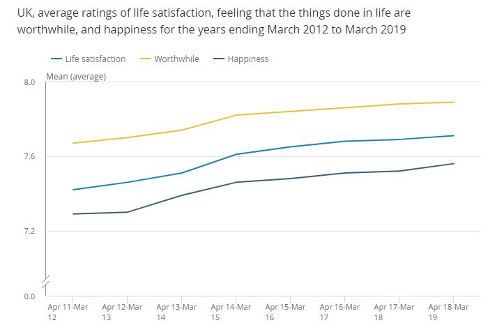
The mean happiness score (/10) for the UK population has increased to all time high of 7.56. ‘Life satisfaction’ and ‘worthwhileness’ scores are also increasing
Anxiety levels are stable
The mean anxiety score (/10) has remained stable at just below 3/10 for half a decade, while the percentage of people reporting high levels of anxiety remains at just under 20%.
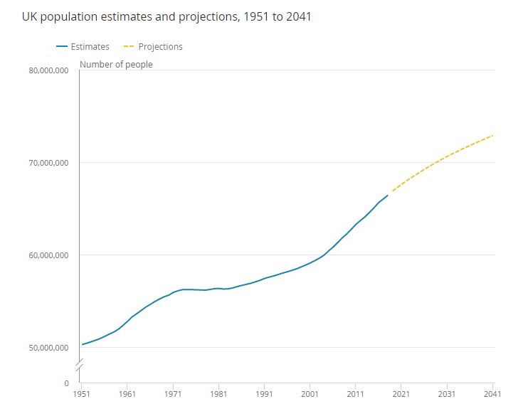
In 2018, the UK’s population reached 66.4 million people, with a growth rate of 0.6% and immigration being the main reason for population growth.
The population is increasing at roughly 350 000 people per year, just over 100 000 of these are due to ‘natural change’ (more births than deaths) while just over 200 000 are due to net migration (more people immigrating than emigrating.
Conclusion: Is life in the UK getting better or worse?
On balance I’d say that the official statistics above suggest that, on average, life in the UK is getting better:
Employment and poverty are both down.
Crime is generally down
Happiness is increasing and anxiety is stable
However, there has been a recent spike in the suicide rate and some types of violent crime are up.
It’s very difficult to say whether or not the increasing population is a positive or a negative: clearly the fact that this is driven mainly by immigration concerns a lot of people, but possibly we need migration to offset the increasing dependency ration associated with the aging population, so this might actually be a good sign!
Question: what other stats do you think should be included in the above?
The 2018 report shows that the overall rate of permanent exclusions was 0.1 per cent of pupil enrolments in 2016/17. The number of exclusions was 7,720.
The report also goes into more detail, for example….
The vast majority of exclusions were from secondary schools >85% of exclusions.
The three main reasons for permanent exclusions (not counting ‘other’) were
Persistent disruptive behaviour
Physical assault against a pupil
Physical assault against an adult.
Certain groups of students are far more likely to be permanently excluded:
Free School Meals (FSM) pupils had a permanent exclusion rate four times higher than non-FSM pupils
FSM pupils accounted for 40.0% of all permanent exclusions
The permanent exclusion rate for boys was over three times higher than that for girls
Over half of all permanent exclusions occur in national curriculum year 9 or above. A quarter of all permanent exclusions were for pupils aged 14
Black Caribbean pupils had a permanent exclusion rate nearly three times higher than the school population as a whole.
Pupils with identified special educational needs (SEN) accounted for around half of all permanent exclusions
The ‘reasons why’ and ‘types of pupil’ data probably hold no surprises, but NB there are quite a few limitations with the above data, and so these stats should be treated with caution!
Limitations of data on permanent exclusions
Validity problems…
According to this Guardian article, the figures do not take into account ‘informal exclusions’ or ‘off-rolling’ – where schools convince parents to withdraw their children without making a formal exclusion order – technically it’s then down to the parents to enrol their child at another institution or home-educate them, but in many cases this doesn’t happen.
According to research conducted by FFT Education Datalab up to 7, 700 students go missing from the school role between year 7 and year 11 when they are supposed to sit their GCSEs…. Equivalent to a 1.4% drop out rate across from first enrolment at secondary school to GCSEs.
Datalabs took their figures from the annual school census and the DfE’s national pupil database. The cohort’s numbers were traced from year seven, the first year of secondary school, up until taking their GCSEs in 2017.
The entire cohort enrolled in year 7 in state schools in England in 2013 was 550,000 children
However, by time of sitting GCSEs:
8,700 pupils were in alternative provision or pupil referral units,
nearly 2,500 had moved to special schools
22,000 had left the state sector (an increase from 20,000 in 2014) Of the 22,000,
3,000 had moved to mainstream private schools
Just under 4,000 were enrolled or sat their GCSEs at a variety of other education institutions.
60% of the remaining 15,000 children were likely to have moved away from England, in some case to other parts of the UK such as Wales (used emigration data by age and internal migration data to estimate that around)
Leaves between 6,000 to 7,700 former pupils unaccounted for, who appear not to have sat any GCSE or equivalent qualifications or been counted in school data.
Working out the percentages this means that by GCSEs, the following percentages of the original year 7 cohort had been ‘moved on’ to other schools.
6% or 32, 000 students in all, 10, 00 of which were moved to ‘state funded alternative provision, e.g. Pupil Referral Units.
4%, or 22K left the mainstream state sector altogether (presumably due to exclusion or ‘coerced withdrawal’ (i.e. off rolling), of which
4%, or 7, 700 cannot be found in any educational records!
This Guardian article provides a decent summary of the research.
Further limitations of data on school exclusions
There is very little detail on why pupils were excluded, other than the ‘main reason’ formally recorded by the head teacher in all school. There is no information at all about the specific act or the broader context. Labelling theorists might have something to say about this!
There is a significant time gap between recording and publication of the data. This data was published in summer 2018 and covers exclusions in the academic year 2016-2017. Given that you might be looking at this in 2019 (data is published annually) and that there is probably a ‘long history’ behind many exclusions (i.e. pupils probably get more than one second chance), this data refers to events that happened 2 or more years ago.
Relevance of this to A-level sociology
This is of obvious relevance to the education module… it might be something of a wake up call that 4% of students leave mainstream secondary education before making it to GCSEs, and than 1.4% seem to end up out of education and not sitting GCSEs!
How doe we explain the recent increase in higher education student suicides? Are there any underlying causes, or is this just a ‘moral panic’?
There has been an increase in the suicide rate among Higher Education students, from 3.8 per 100, 000 in 2006/07 to 4.7 suicides per 100, 000 in 2016/17, according to new data released this week by the Office for National Statistics (ONS).
Google headlines for ‘student suicide’ search, June 26th 2018
NB this isn’t only the latest data, it is also ‘new’ in the sense that this is the first time that the ONS has published data specifically focussing on ‘higher education student’ suicides, so in this sense I guess it is inherently news worthy, and the release of the data on the 25/06 certainly caused quite a stir in the mainstream news and talk shows following the release, with the main focus seeming to be on ‘what we should do about the problem of increasing student suicides’, and the fact that this is ‘new data’.
However, to my mind, while I appreciate the fact that there is an underlying increase in students reporting mental health issues that seems to correlate with the increase in suicide, I also believe there’s reason to be sceptical about the usefulness of the above data, especially since the ONS itself refers to these stats as ‘experimental statistics’.
Below, I summarise what the ONS data tells us about HE student suicides, and then contrast two sociological approaches to interpreting this data: the first being a broadly ‘structuralist’ perspective which accepts that the data is basically valid and asks ‘why are there more student suicides?’ (which was pretty much the narrative in the mainstream news); and a second, broadly Interpretivist approach which questions the validity of this data, and asks whether or not all of this might be something of a moral panic?
What does the data tell us?
Firstly, there has been an increase in the suicide rate among higher education students if we compare the data from 2006/07 to 206/17
However, although the data appears to have stabilized in the the last three years, the ONS reminds us that these rates are based on such low numbers (95 suicides in 2016/17) that it’s hard to draw any statistical significance from these figures.
Secondly, male students are approximately twice as likely to commit suicide than female students
Between the years of 2001 and 2017, a total 1,330 students died from suicide, of which 878 (66%) were male and 452 (34%) were female.
Thirdly, older students are more likely to kill themselves than younger students
This actually surprised me a little (note to self about ‘stereotypes’ of suicidal students): higher education students aged 30 or over are twice as likely to commit suicide compared to students aged 20 and under.
Some limitations of the above data
I recommend checking out the publication (link above and below at the end) by the ONS, they mention several limitations with this data: for example, the low overall numbers make it hard to draw any conclusions about the suicide rate with any degree of confidence (statistical significance); and the year on year on year data might not be accurate given delays in recording a death as a suicide, due to inquests taking a long time in some instances (e.g. a suicide which happened in 2016 might appear as a recorded suicide in 2017).
What are the underlying ’causes’ of the ‘increase’ in student suicides?
The mainstream media narrative pretty much took the increase in student suicides at face value, and offered up some of the following possible reasons to explain the increase:
The suicide stats are the ‘extreme ‘tip’ of something of a ‘mental health crisis’ in universities – higher number of students are making use of mental health services, which are under-resourced: universities aren’t giving enough support to vulnerable students who are suicidal.
The increase in mental health problems/ suicide could be due to the fact that university life has become more stressful: there’s more pressure to succeed and get at least a 2.1, and students no longer go to university to have ‘three years off’ (like I did ;)).
Related to the above, mental health problems could be related to the ‘double adjustment’ (my invention that!) students have to go through: they have to adjust not only to the fact that university life isn’t as much fun as its been made out to be (at yer glossy open day), and they have to adjust to the fact that they are just not ‘that clever’ (the later probably applies more to hot-housed privately schooled students, and to those students who are more likely to have had their predicted grades inflated).
A broadly Interpretivist approach to understanding these stats…
Interpretivists would be much more likely to question the validity of these stats, and thus the validity of the view that there is an increase in higher education student suicides, and the opinion that this is something which we should be concerned about.
There are certainly sufficient grounds to be sceptical about these stats:
If you were to compare the three year average for 2002/03 to 2004/05 with the three year average for 2014/15 to 20016/17 the ‘increase’ is much less significant.
The ONS itself says you cannot draw any significant conclusions from the small numbers used to derive these stats. And again, they even explicitly refer to them as ‘experimental stats’!
The overall number of student suicides is half that of the suicide rate in the general population: surely the headlines should be: ‘”great news, going to university helps lower suicide risk”?
There might also be an argument to made that this is something of a moral panic: it seems to me that the media perpetuate the idea that the typical suicidal student is a 19 year old female, when actually this is atypical – a 30+ year old male student is about 4 times more likely to kill himself.
I also think ‘class’ might come into this: Bristol University (A Russel Group, and thus a very middle class university) has been in the news recently due to its high suicide rates:
So, might this uncritical news reporting just really be about stoking a moral panic not so much about the ‘increase’ in higher education student suicides (of which there appears to be no significant evidence), but really about the increase in suicide among our ‘precious’ middle class male students?
Official Statistics are a quick and cheap means of accessing data relevant to an entire population in a country.
They are cheap for researchers to use because they are collected by governments, who often make them available online for free—for example, the UK Census.
Marxists might point out that the fact they are free enables marginalised groups to ‘keep a check on government’.
More generally, they are useful for making quick evaluations of government policy, to see if tax payers’ money is being spent effectively–
Official statistics are a very convenient way of making cross national comparisons without visiting other countries.
Most governments in the developed world today collect official statistics which are made available for free.
More and more governments collect data around the world, so there is more and more data available every year.
The United Nations Development Programme collects the same data in the same way, so it’s easy to assess the relationship between economic and social development in a global age.
Theory and Methods A Level Sociology Revision Bundle
If you like this sort of thing, then you might like my Theory and Methods Revision Bundle – specifically designed to get students through the theory and methods sections of A level sociology papers 1 and 3.
Contents include:
74 pages of revision notes
15 mind maps on various topics within theory and methods
Official Statistics on schools, teachers and educational achievement provided by the United Kingdom government provide an overview of the education system. They are useful for providing an ‘introduction to the state of education in the U.K’, before embarking on the core content of any sociology of education course and providing a basis for comparing the U.K. education system to the education systems of other countries, which would be relevant to the module on global development.
I will also provide a brief discussion of the validity and representativeness of the official statistics below, tying this into research methods.
I only deal with state-schools in this post, I’ll do a separate post in future on private, or independent schools in comparison to state schools.
Also, the post below deals primarily with England and Wales, I will add in details for Wales and Scotland when I can.
For 2020-21 expenditure per education sector broke down as follows:
Primary education expenditure – £27.3 billion
Secondary education expenditure – £40.0 billion
Tertiary education expenditure – £4.9 billion
Spending Per Pupil was £6500 in 2019-2020
The above chart, from the Institute for Fiscal Studies shows us education spending in real terms at 2019-2020 places. We can see that in real terms expenditure per pupil has decreased slightly since 2010, when New Labour left office and the Tories came to power.
This means primary schools are lot smaller in scale in that each of them has, on average, fewer pupils in them, and should be more ‘locally based’ for most parents.
Secondary schools are a lot larger, will have many more pupils in them, have more of an ‘education factory’ feel to them and be more widely dispersed, meaning children will have to travel further to them.
This is despite the fact that there are more secondary school aged pupils compared to primary school aged pupils.
There were 10.5 million school pupils in England and Wales in 2020-2021
This reflects recent demographic trends in the United Kingdom – a baby boom which started in the mid 2000s has seen an increase of 400 000 pupils in the school system as a whole (primary and secondary).
There were 11 600 pupils in Pupil Referral Units in 2021
The number of pupils in PRUs fell from over 15000 in 2015/16 to just just 11 000 by 2020/21
A total of 12.6% of pupils have Special Education Needs in 2021-2022
And four percent of these have a formal statement.
There has been a slight increase in the number of Special Education Needs pupils since 2015/ 16 – a 1% increase in all SEN pupils and a 1.2% increase in SEN pupils with statements.
I’ve left the following historical data in place following a recent update of this post (updated October 2022) as I think it demonstrates how such statistics in particular are socially constructed…
Between 2010 to 2015 the number of pupils with special educational needs fell from 21% to 15%
NB – if you read this in conjunction with the ‘types of school chart’ above, then it suggests that special educational needs (SEN) students are becoming increasingly segregated into special schools and/ or pupil referral units, rather than being dealt with in mainstream secondary schools.
You might also want to think about the extent to which ‘Special Educational Needs’ and ‘Special Educational Needs with statements’ are socially constructed.
Looking back at 2007, 20% of pupils were officially characterised as SEN, but by 2021 this had fallen to 12.6%.
According to labelling theory this is more likely to be because the formal criteria and processes according to which pupils are given the SEN label have changed over the past 15 years, rather than any underlying changes in the actual number of pupils with Special Educational needs.
At the end of 2020 the proportion of 16-18 year olds in education and work-based learning was 81.2%
NEET stands for ‘Not in Education, Employment or Training’ and the government keeps records of the proportion of 16-14 year olds which fit into this category.
The medium term trend in NEETs is that the proportion has fallen from 16% of 16-24 year olds in 2013 down to 11% in 2017.
The NEET figure has been relatively stable for the last five years, holding at around 11% up until today in 2022.
There were 2.4 million students in UK Higher Education Institutions in 2019-2020
The number of full time equivalent students studying their first degrees or post graduate degrees has been increasing steadily over the past few years.
Around 1.9 million students are studying undergraduate degrees or equivalent while 0.5 million are studying towards a Postgraduate degree.
The vast majority of students studying towards their first degree are British, almost 80% in fact, but around 40% of students studying PostGraduate degrees in UK institutions are from abroad, and most of those from outside the UK!
There were 465000 Teachers (FTE) in the UK in 2021/22
There were 465 000 Full Time Equivalent (FTE) teachers employed in England and Wales in 2021/22.
There were 503 000 Full Time Equivalent support staff
The total FTE number of staff employed in schools in 2021/22 was 968 000.
30% of teachers drop out after 5 years of qualifying
12.5% of teachers drop out after just one year of qualifying
Just over 30% drop out within five years.
How useful are these education statistics?
Such statistics are a useful starting point if we wish to make cross-national comparisons between the U.K. education system and the rest of the world, which would be useful for students of global development, given that education plays a key role in development. Indeed if we wish to compare the relationship between education and development in several countries, statistical rather than qualitative comparisons may be the only way of doing so.
From an arrogant, modernisation theory perspective, these statistics provide an indication of the level of investment required in terms of expenditure and teachers, and the types of outcome that less developed countries should be aiming for.
Most of the education statistics above count as ‘hard statistics’, i.e. there’s little room for disagreement over the ‘social facts’ which they show – for example, it’s hard to argue with the stats on ‘number of schools’ and ‘number of qualified teachers’.
However, others are much softer, and have more validity problems, and can be criticised for being social constructions rather than reflecting underlying reality: the statistics on special educational needs clearly come under this category – there is simply no way the underlying numbers of students with ‘SEN’ have decline from 21 to 15% in 5 years while the number of certificated SEN kids have increased – what’s really happened is that the number of kids which schools categorise as having Special Education Needs has decreased in the last 5 years, probably because the Tory’s cut previously existing funding for this category of student in 2010 (ish).
Signposting and Related Posts
As mentioned above this is introductory material for the education topic. For more posts covering theories of education, education policies and educational inequalities by class, gender and ethnicity, please see my sociology of education page.
Links to statistics on education in the United Kingdom:
Most of the statistical sets below are updated yearly, or more frequently.
Education and Training Statistics for the U.K. – published by the department for education. In this source you’ll find data on the number of schools, teachers, and teacher-pupil ratios as well as basic educational achievement data by Free School Meals, gender and ethnicity. Published annually in November.
School Workforce in England – covers teacher numbers and pupil-teacher ratios in primary and secondary schools in England and Wales. The latest figures from November 2021.
Special Education Needs in England – details of children with special education needs, by type of need, and broken down by school type and gender (statistics derived from the ‘schools census’).